Exhibition DataBlick : Where Data Meets Art
1
2
3
4
5


Bay Area Bike Share
In 2014 over 85% of riders using the Bay Area Bike Share withing the city of San Francisco were yearly subscribers. For $88 a year, subscribers area allowed unlimited rides at no additional charge as long as each ride duration is less than 30 minutes. Current bike station locations are concentrated downtown, but new stations are being proposed, making the service a viable commuting option, either on its own or in conjunction with MUNI or BART service.
What train stations could a rider reach in 30 minutes? This network analysis shows the shortest route path between current and proposed stations that could be reached in 30 minutes.
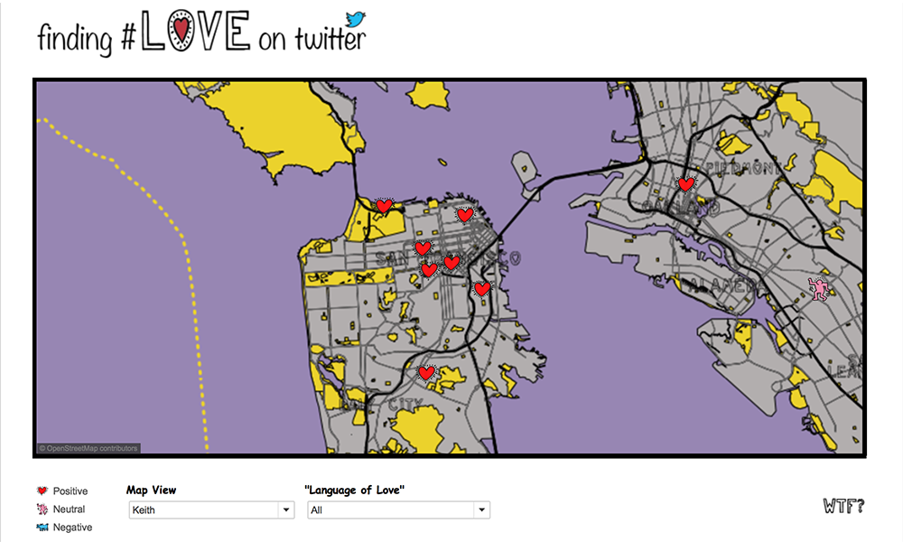
Finding #Love on Twitter
The final viz, “Finding Love on Twitter” was created as an excuse to showcase how multiple map layers created in Mapbox for use in Tableau, and the ability to toggle them on and off.
This adds onto the lessons on Mapbox customization for Tableau by showing you how to:
- Import custom shapefiles
- Edit them in QGIS (optional)
- Style them in Mapbox
- Add them to a Tableau .tms so you can toggle them on and off in many combinations to help your visual analysis.
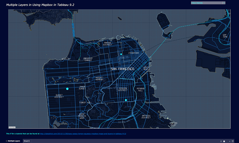
Multiple Mapbox Layers in Tableau 9.2
Learn how to add multiple Mapbox layers using the new UI in Tableau 9.2 and create a Parameter to swap out map view.
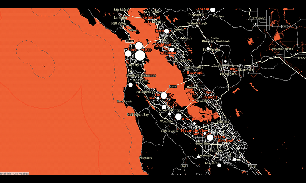
Fast and Fabulous Custom Maps using Mapbox in Tableau
So the last time I wanted a custom map, I ended up building my own WMS and spending months and $’s to get the map I wanted. Then one day recently, I had a cocktail with Allan Walker (that insane mapping Zen dude) who pointed out that if you just opened up a .tms file in notepad, there just wasn’t all that much to it but a wee bit of xml.
What follows is another DataBlick tutorial on making custom maps in Mapbox.
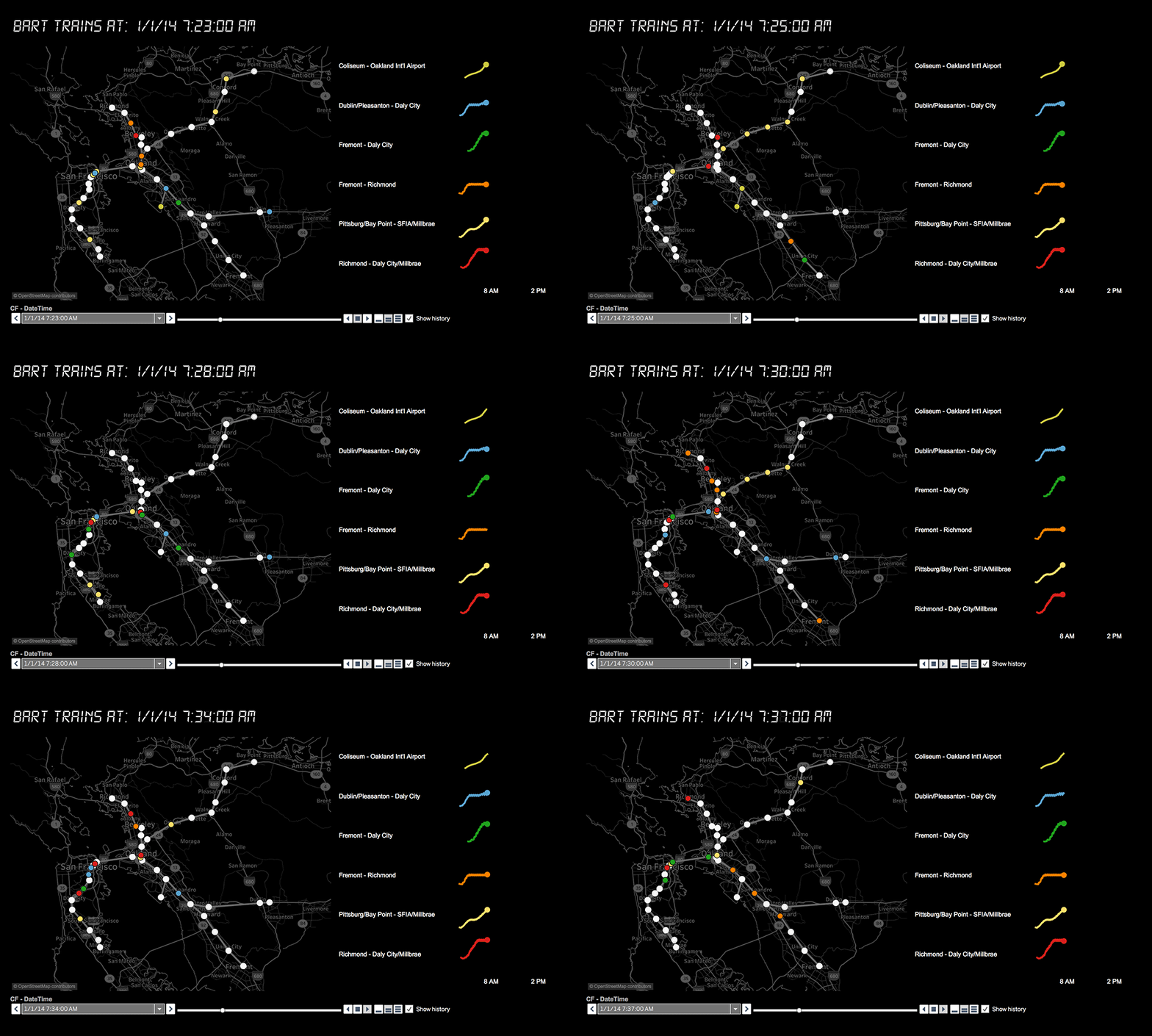
Building a Visualization of Transit System Data Using GTFS
The General Transit Feed Specification (GTFS) defines a common format for public transportation schedules and associated geographic information. GTFS “feeds” allow public transit agencies to publish their transit data and developers to write applications that consume that data in an interoperable way.
This tutorial will show you how to use Tableau to build a map of transit data and incorporate it in a BI dashboard for analysis. What is the average route duration, fare, number of stops? How many are wheelchair accessible? Don’t care about BART? Check out the list of all the agencies that use this format at http://www.gtfs-data-exchange.com/agencies .