Exhibition DataBlick : Where Data Meets Art
1
2
3
4


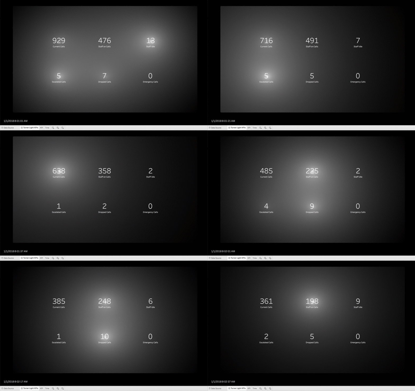
Lighting as an Attentive Attribute in KPI Dashboards
About 3 years ago, I saw an exhibit at the deYoung of J. M. W. Turner. It was a painting, “Slavers Throwing Overboard the Dead and Dying, Typhon coming on.”
I have been mulling over his technique of using broadly applied atmospheric washes of paint to draw focus and create intensity, and how to apply it to data visualization. We usually use the attentive attributes of color, size, shape, position, etc. to draw focus in dashboards.
I have been spending a lot of time pondering the UX of things not related to data viz and asking how to apply those design ideas to visualization work, as with my Widget post. Outside the sphere of data viz, in everything from photography, to video games, and interior design, lighting is a powerful way to draw focus and create emotion. I wanted a Marks card with a "Lighting" shelf.
Mandelbrot Set in Tableau
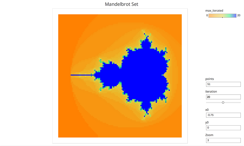
The Mandelbrot set is produced via recursion on the complex plane. Alternatively, this can be thought of as a 2 dimensional real iterative process, with a bit more complexity in the formula.
A point is out if the sequence of points diverges (i.e. gets further and further from zero). The remaining points form the Mandelbrot set. If the distance from zero ever becomes greater than 2, then the sequence is certain to diverge. This fact is often used to color the complement recording the first iteration where this distance was greater than 2. In practice only finitely many iterations can be performed (and with finite accuracy) so this is really a sketch. The viz is parameter driven, so the center, zoom, number of iterations and resolution can be adjusted. There are only 8 rows in the source data, which is not too shabby for an infinitely complex mathematical structure.
Building Life in Tableau
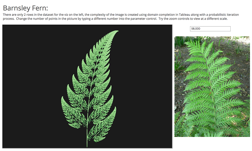
DNA can be expressed as a number, if say you wanted to upload yourself to your Tableau public account. Would you fit? There are 4 base pair possibilities, so this could be encoded in 2 bits; so with 8 bits in a byte you could store 4. There are about 3 billion base pairs in human DNA, 3 billion/4 = 750 million bytes or about 750 megabytes. So even in an uncompressed format you would fit well under the current 1GB storage limit of Tableau public! So future generations of data enthusiasts could download you as a packaged workbook, then using their advanced technology they could bring you back.
Orrery Remix
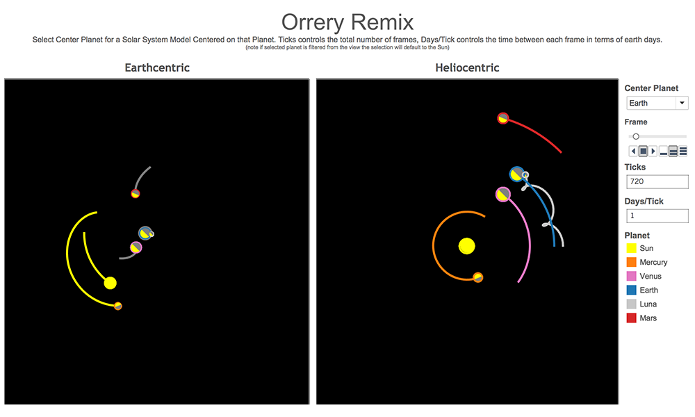
The Orrery is computation driven; the position of the planets are computed on the fly in Tableau and the data source driving this piece of art is almost an afterthought. It could literally have been built on Superstore Sales, you just need a place to hang the results of computations. In the case of Jonathan’s Orrery, this structure comes in the form of a SQL query that generates a hugely redundant data set. In all it has 51,840 rows. There are 18 planets (counting the sun and various moons), 360 ticks for the frames in the animation and 8 wedges for the slices that make up the pie charts used to draw each planet showing day and night (best use of pie charts ever!), 18 x 360 x 8 = 51,840.