Yes, this is another Allan Walker and DataBlick co-production. It is also based on the work of the amazing and talented Craig Bloodworth who figured out how to incorporate Mapbox in Tableau and graciously gave my first .tms file. Allan and I worked on many aspects of the project together and this is a joint post with half on DataBlick, focusing on the maps, and the other on his blog, focusing on sentiment analysis and using Voice Control.
If you haven't already, please start with the post http://datablick.com/2015/02/04/fast-and-fabulous-custom-maps-using-mapbox-in-tableau/,
This adds onto the Mapbox customization for Tableau by showing you how to:
- Import custom shapefiles
- Edit them in QGIS (optional)
- Style them in Mapbox
- Add them to a Tableau .tms so you can toggle them on and off in many combinations to help your visual analysis.
If you want to click along and learn, please download the latest version of Mapbox Studio at mapbox.com You will need a Mapbox account. Warning, you will probably want to be able to have multiple maps as this point and might need a paid account which is about 5$ a month. I find it better than shoe shopping, so I am up to the 50$ a month account. My new guilty pleasure!
Optional, download QGIS if you want to get fancy with your own shapefiles.
The final viz, “Finding Love on Twitter” was created as an excuse to showcase how multiple map layers created in Mapbox for use in Tableau, and the ability to toggle them on and off. It was for a presentation at the SFTUG graciously hosted by Daniel Seisun and the kind folks at Twitter.
We each seem to have a different take on how this project got started. You can read what "he said", or you can just believe me ;-P. It shows a fun contrast and collaboration of how we each came into the project and how we egg each other on.
In response to Allan's intro:
Really? That's how it went down? So don't remember that at all, but I was on my 2nd Manhattan and a few shots of some bizarre moonshine that Noah and Joe had brought.
I recall feeling a bit bitter about the topic of "love". I wanted to capture the tweets for things that were both about love on Valentines day, and then of course what someone who was anti-Valentines might tweet. #Love vs #Hate or #Sex (not sure what the “opposite” is), #Champagne vs #Whiskey (or #beer), etc. It would all culminate in a horrific R. Crumb'esc commentary / viz. I was particularly excited about a Mapbox style called “Pencil” that would be perfect.

Smack down data design lesson 1. Wait for the data to tell the story and determine the design, not the design to determine the story.
As usual, Allan sprang into action, and about 5 whole minutes later had set up pulls of tweets on various hashtags to be archived in google spreadsheet by hashtag. Set it and forget it, right?
Well some time goes by, and it is actually getting to be close to Valentines day, and so I go to check on the “crock pot” Google sheets that have been supposedly simmering and getting juicy with love tweets, only to find that the volume and content of Geo-tagged tweets is best to be described a “Meh”. There is no "bitter" to be displayed in all of it’s glory. There are like 100 tweets and they are all really, really boring.
I am presenting at an upcoming SFTUG at Twitter on creating Mapbox maps for use in Tableau. If anyone can help get me “tweets of #love”, surely Twitter can! And graciously they agree to! Thank you Daniel! By now though, I am not so bitter, and also am kind of embarrassed to ask for tweets on things like #sex and #whiskey and decide that maybe just looking at #love would be good. But of course I want to use a Mapbox map of the world, and the world doesn't only tweet in #love to talk about love. So of course Allan produces a list of words used for love in the top 20 languages used in the world in under 2 seconds flat, and it is off to the kind folks at Twitter.
Super excited! Twitter data from the fire-hose!!!!!! There “got to be gold in them tweets”!
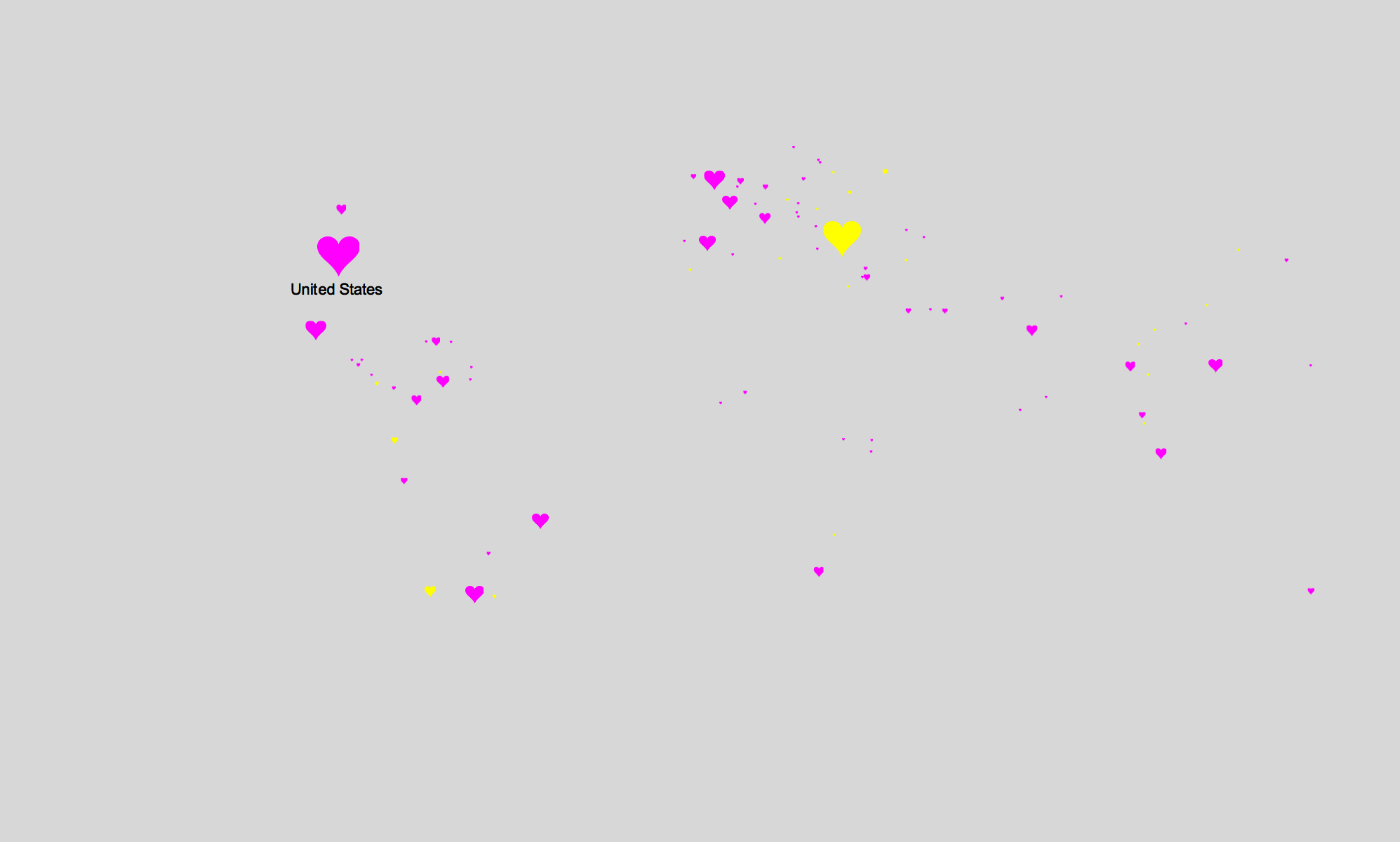
Sadly no, still “Meh”. At best we created an Esty’s like cartoon of love raining down by country. Most of the tweets were actually for free giveaways and contests.

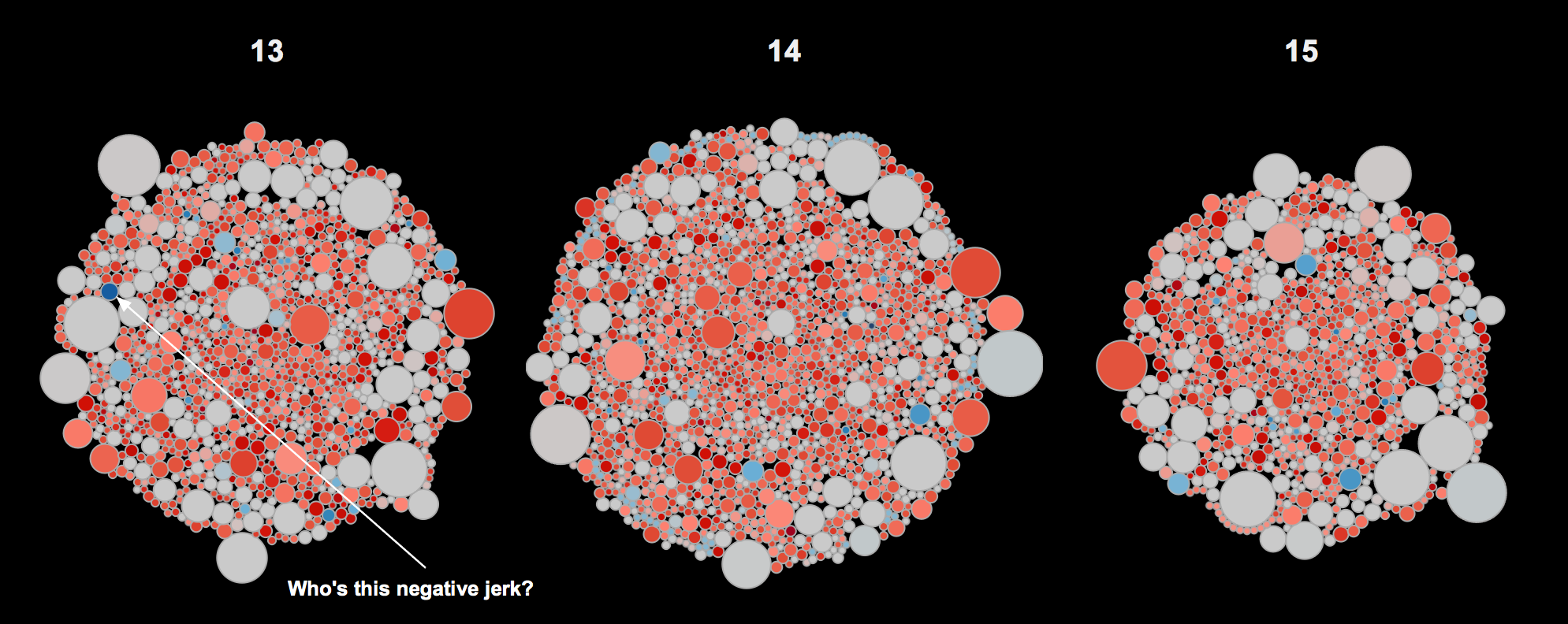
Exploring all the tweets, the most are for @IntelJapan and @IloveHQ for a giveaway contest. Super romantic, right? I did love looking for the haters, since Allan added a bunch of Sentiment Analysis courtesy of Semantria.

Well, I still have to present at the SFTUG and I still am committed to making the data about #love on Twitter, so when the data fails you, whip out your design card and put some lipstick on it… The resulting concept was to use the Twitter data to create an App to help me "Find Love on Twitter".
Lesson 2, even though you make it pretty, if the data is boring, the viz ain’t gonna sing.
In #love with my new Mapbox skills, I wanted to take them to the next level by being able to not just customize their existing fabulous, out of the box styles, but add my own layers, layer then on top of one another, and be able to turn them on and off in Tableau. You might want to do something similar to add congressional districts, agricultural land plots, etc. My example is a bit more silly, but the process is the same.
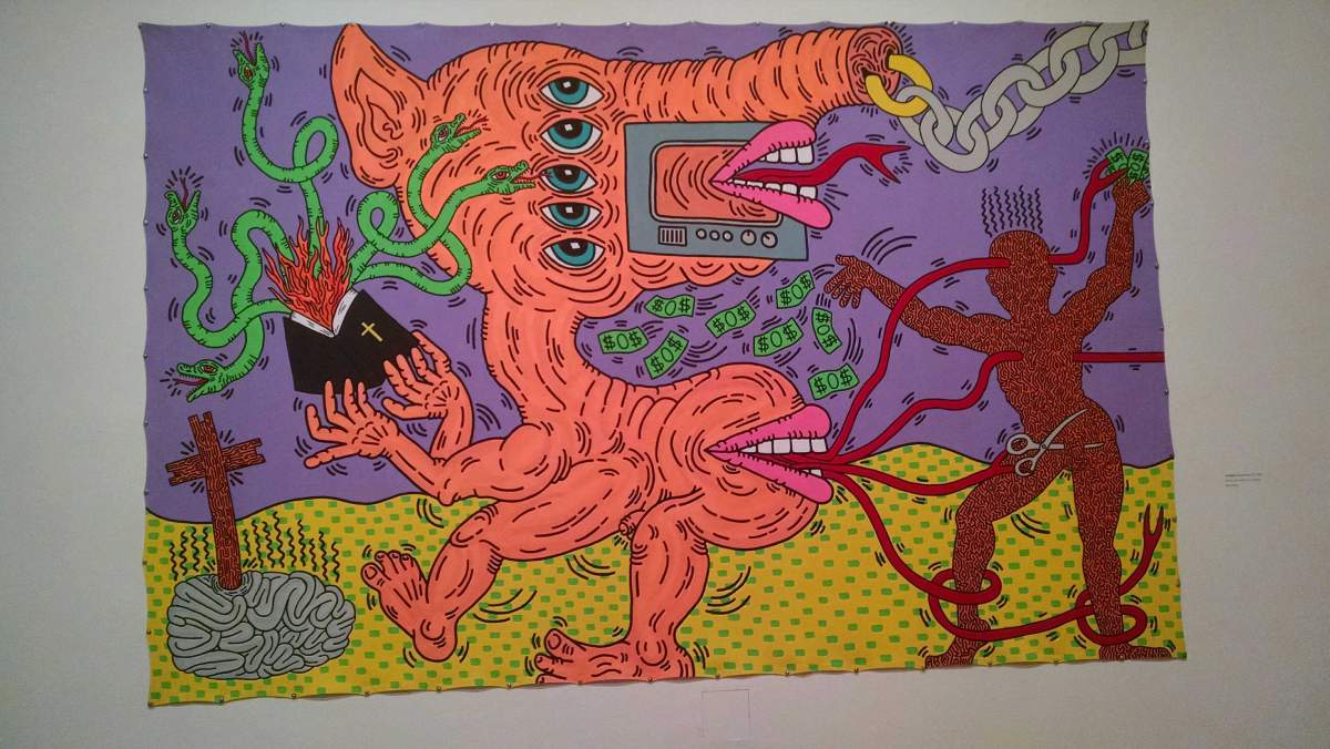
My design inspiration. I had just been to the Keith Haring exhibit at the deYoung and really enjoyed this painting:

“The TV monster and the helpless man.” Haring’s figures are captives and victims of forces they may have created but no longer control. I kind of really liked this messaging and aesthetic applied to a concept of online dating based on social media data and decided to create my “Finding Love on Twitter” viz with a similar aesthetic.
Now come click along and get to some map making!
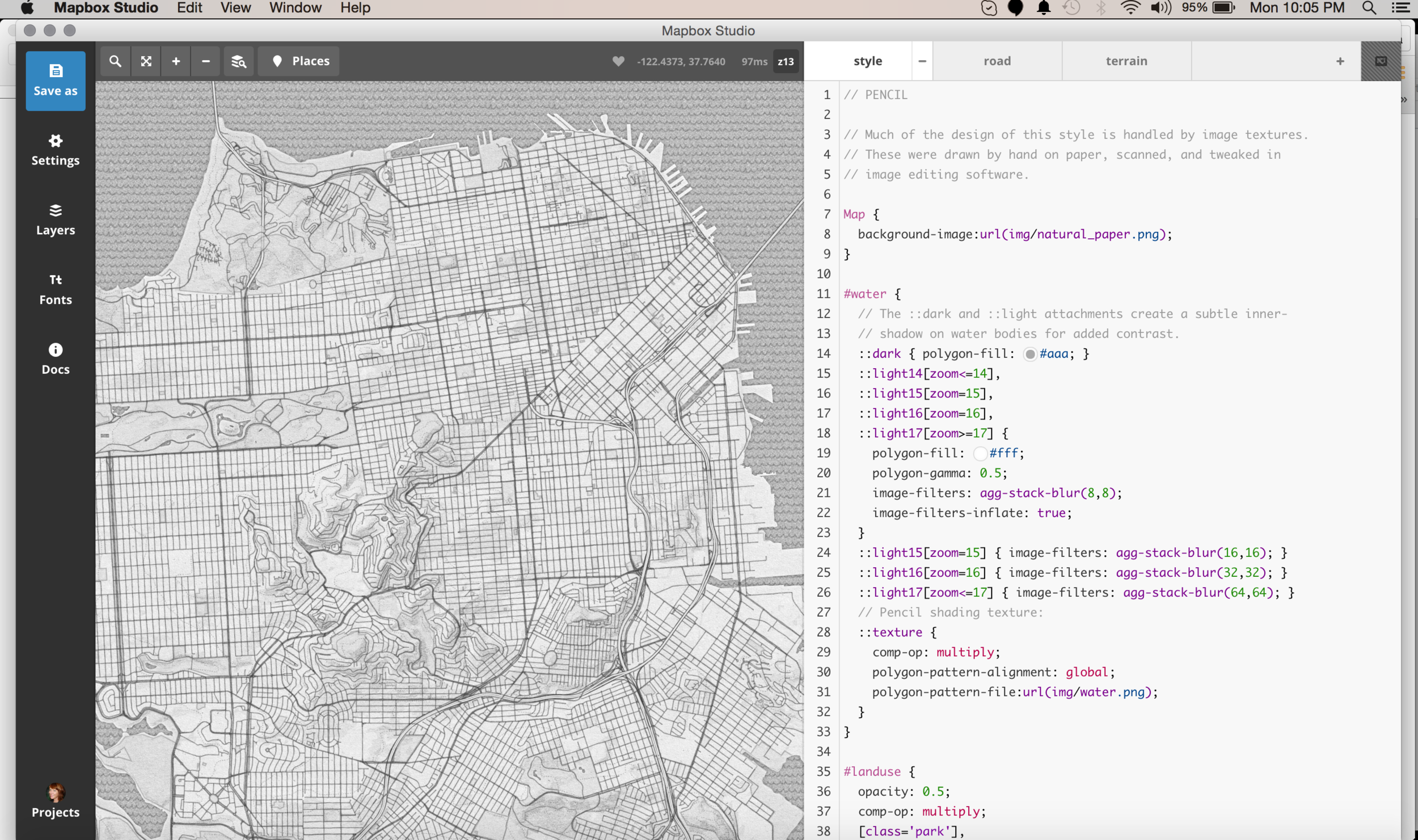
Starting with the Mapbox Style “High Contrast”, I set out to create the background map for my #love viz. If you want more information on custom map styling, using a pre-defined map source in Mapbox, please refer to my previous post at http://datablick.com/2015/02/04/fast-and-fabulous-custom-maps-using-mapbox-in-tableau/
If I was really going to create a faux viz “app” that I would use to find #love based on Twitter data, I needed to stretch the ridiculous that much more. I wanted to be able to add other geodata to the mix to show off my new custom Mapbox layers skills, and came up with the idea of being able to turn on and off MUNI railway lines, because I could obviously only look for love if someone lived near public transportation, and also to create shape files of neighborhoods that I would not consider finding love in. Sorry Marina boys.
A very simplified description of map making is to think that everything for the most part is either a points, lines or shape (polygon), and you style each and then put them all together to make a map. To style them in Mapbox you use CartoCSS which is very similar to styling a web page. An example would be:
#layer {
line-color: red;
line-width: 2;
}
Where the #layer is the name of a layer, for example streets, and the style of the lines in that street layer are a red line with a width of 2 pixels.
Let’s go find some shapefiles layers to import.
Thankfully there are many free shapefiles out there to take advantage of, such as a google search showing a ton of shapeless for San Francisco. I usually use this site: https://data.sfgov.org/data?search=shapefiles&dept=&category=&type=
Your downloaded files will most likely be in a folder that contains 5 files. These files have the same name, but different extensions. You will need them all, and they need to be zipped in one file to import to Mapbox.
Optional QGIS Step:
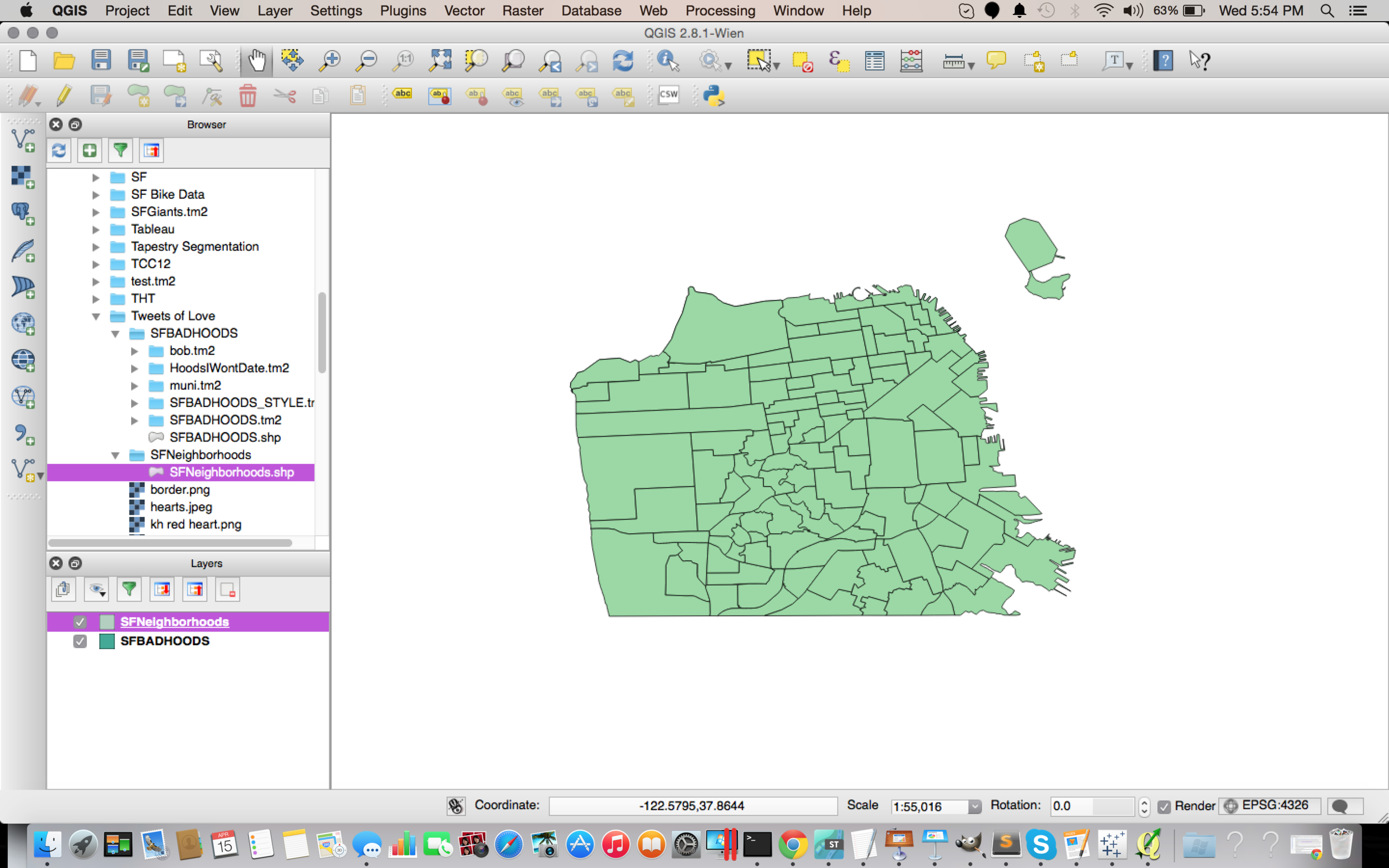
To look at, and play with my newly found shapefiles, I use an open source tool called QGIS. If you need to, once you import your shapefiles, you can edit them so they are are just how you want them to be. To do this, start a new project and from the "Layers" menu, select "Add Vector Layer.

You should now see your shapefiles

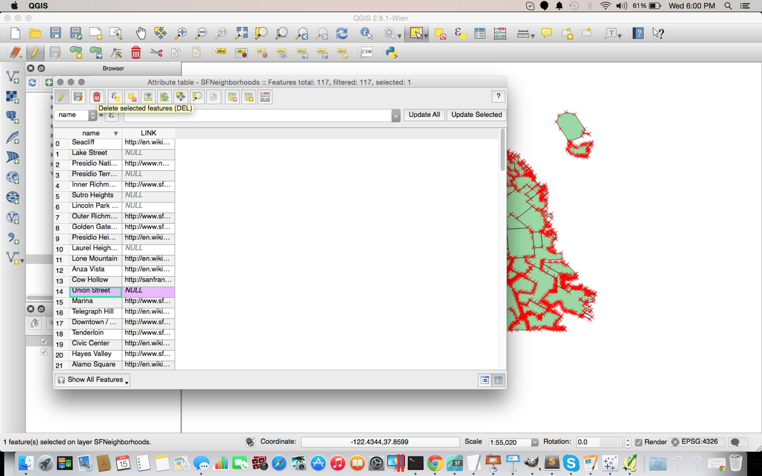
In my example, I wanted to be able to have a layer of neighborhoods where I would not consider dating be a map layer that I could turn on and off in Tableau. As such, I only wanted to keep bad neighborhoods, and delete good ones. This is not necessary before importing them into Mapbox, but it is also a great way to see any other attributes associated with the shapefiles like links to other information, attributes that group them together, or just plain see if what you downloaded was actually what you wanted. You can also create your own shapes if you like, or add attributes to existing ones.

Here is the updated map with only the neighborhoods that "I won't date in".

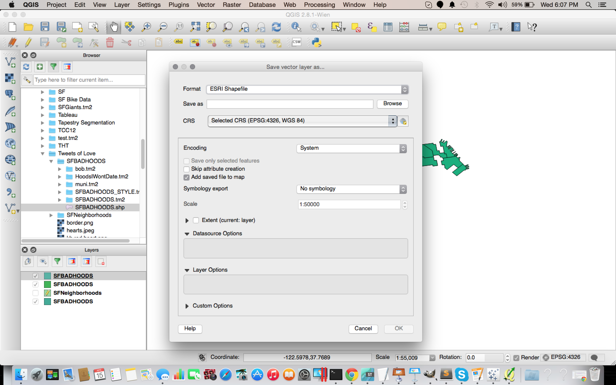
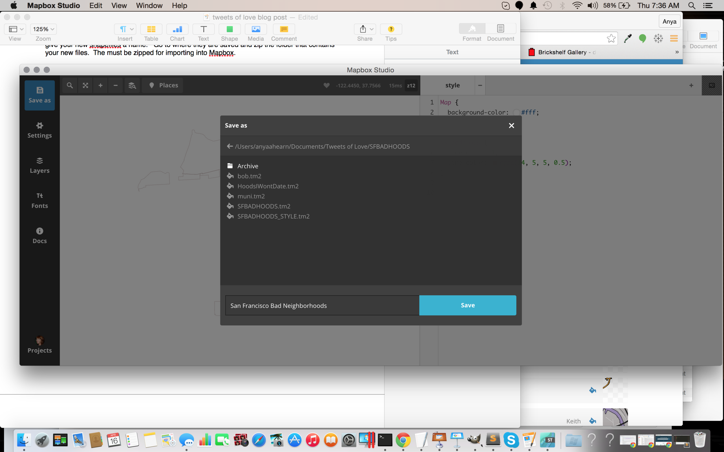
Once you are finished editing your layers, select the “Layers” menu and then “save as”, and give your new shapefiles a name.

Go to where they are saved and zip the folder that contains your new files. The must be zipped for importing into Mapbox.
End of Optional Step and back to Mapbox
Go to mapbox.com and login to your account. Click on “Data” in the upper left corner. Then click on the “upload” button, so we can upload your data to Mapbox. 
Browse to the file on your computer and upload it. It will take a few moments to process the upload. Once it is uploaded, click on the little copy icon to the right of the ID of your new data file.

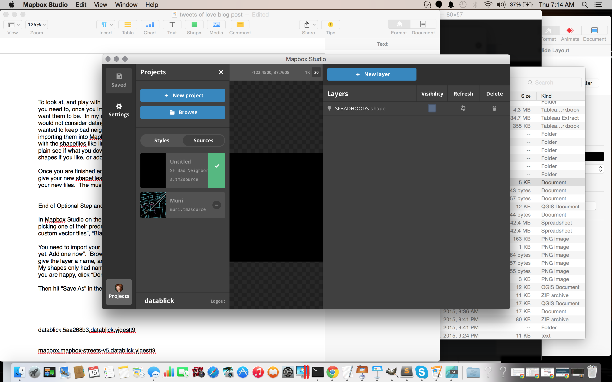
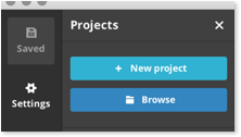
In Mapbox Studio on the lower left corner, click on “Projects” and then “Create New”.

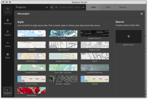
Instead of picking one of their predefined styles, we will scroll down and use our newly created and uploaded source. Use “Paste” to paste the ID and hit “Create”.

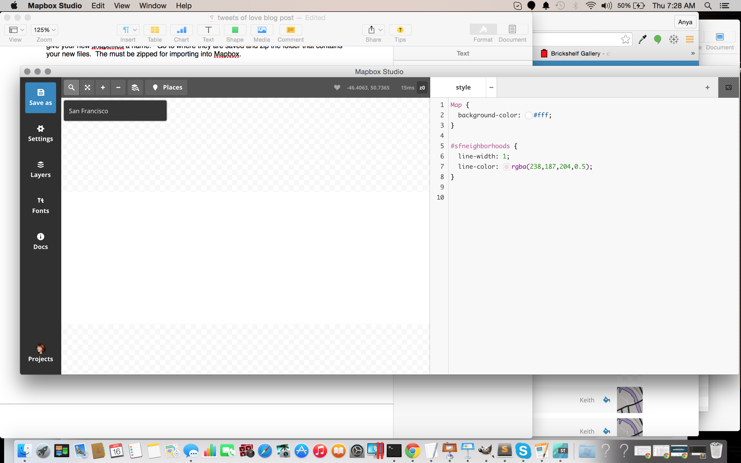
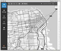
Oh, no? Where did my shapes go? Remember I was using San Francisco, and this showing a map of the world, so we need to search for SF, buy using the looking glass in the upper left corner.

Type in San Francisco, and a few results come back. Select San Francisco, California, and then click on the looking glass again to hide it. You should now see our San Francisco Neighborhoods. Note your shapes may look different than mine if you did not use the Optional QGIS step to delete certain neighborhoods. Either way, you will see a bunch of outlines of SF neighborhoods in Mapbox Studio and an area to the right where you can style them.
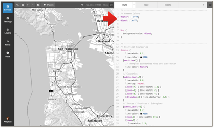
 Make a simple change, like changing the color of the outline of the shapes by clicking on the small button to the right of “line-color” and picking a new color. Alternately, you could just type in the color Hex value if you know what color you want. You have to click “Save” in the upper right corner to see the change you just made. Note, when you hit Save, your project is now saved with a new Folder on your local machine with the extension “.tm2source”. This is where all the assets that make up your layer are stored.
Back to your map layer, these are actually polygons, so we can fill them with a color if we like too. For example, you could add the following to fill the shapes with hot pink. You must hit "Save" to see any changes.
#sfbadhoods {
line-width: 1;
line-color: rgba(14, 5, 5, 0.5);
polygon-fill: #fd10cf;
}
If you want more information on styling your map elements, Mapbox has an online tutorial that walks through different options, or you can try anything that you might do using normal css formatting. For the most part they work here too! Go ahead.. “maps gone wild” time! However, if you want to be lazy (it’s okay!) just use my style.
Hoods Style
Map {
/// background-color: #fff;
}
#SFNeighborhoods {
line-width: 3;
line-color: #000000;
//polygon-fill: #d444dd;
// polygon-opacity: 0.4;
}

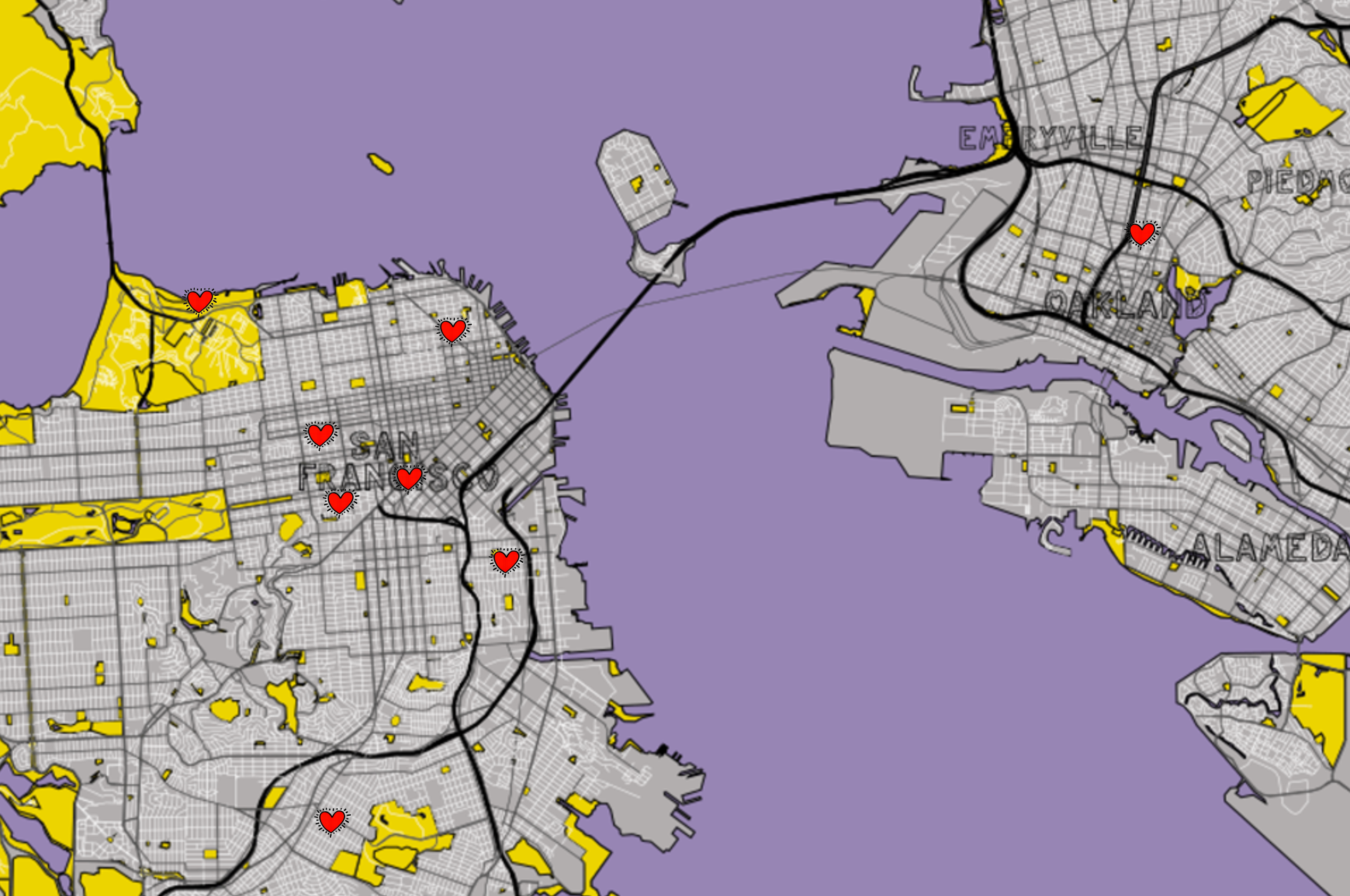
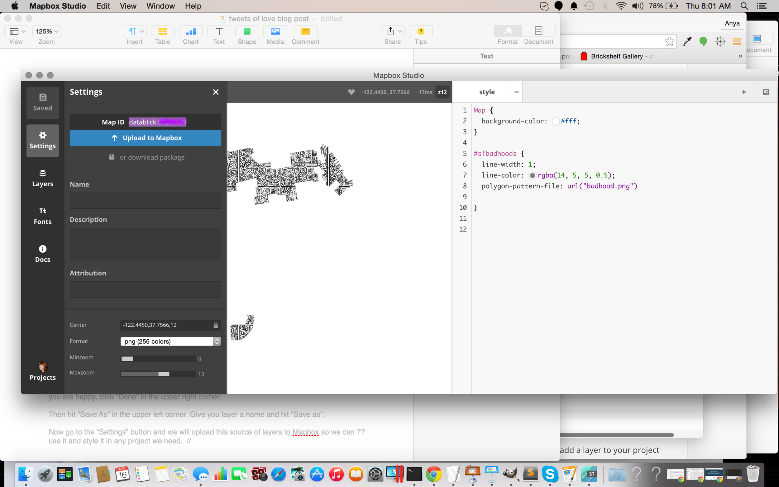
As I mentioned before, I wanted to make my Viz have the aesthetic of that Keith Haring painting, so I wanted to fill the polygons with some of his art. To fill a polygon with a pattern or image you would using the following code which should point to an image file that you saved in your “My Project”.tm2source folder. I used an image of a painting and referenced it as below after putting in my tm2source folder:
polygon-pattern-file: url(“/badhood.png");
Hit “Save” again, and you should now see the polygons filled with the painting. Sweet!


Once you have your layer styled the way you want it, then you need to upload it to Mapbox. Click on “Settings”, and then Upload to Mapbox”. Copy the ID that it returns, you will need this for your .tms file that Tableau will point to.
Now go ahead and have some fun. Add a few more shape layers, such as MUNI lines, water, bike lanes, police stations, whatever your heart desires. I’ll wait for you…..
For this exercise, you may want to add a basic map to put these layers on top of, so go ahead and create a new project in Mapbox Studio, based it on one of their predefined styles and upload it to your account and copy the ID or just use the one that you made when you followed my previous post http://datablick.com/2015/02/04/fast-and-fabulous-custom-maps-using-mapbox-in-tableau/ because of course you did that, right?
Are you ready? You should now have at least 2 layers, the one you created based on an existing Mapbox style, and the one(s) you created with your own shapefiles. Let’s get these layers into Tableau!
Creating a .tms with multiple layers
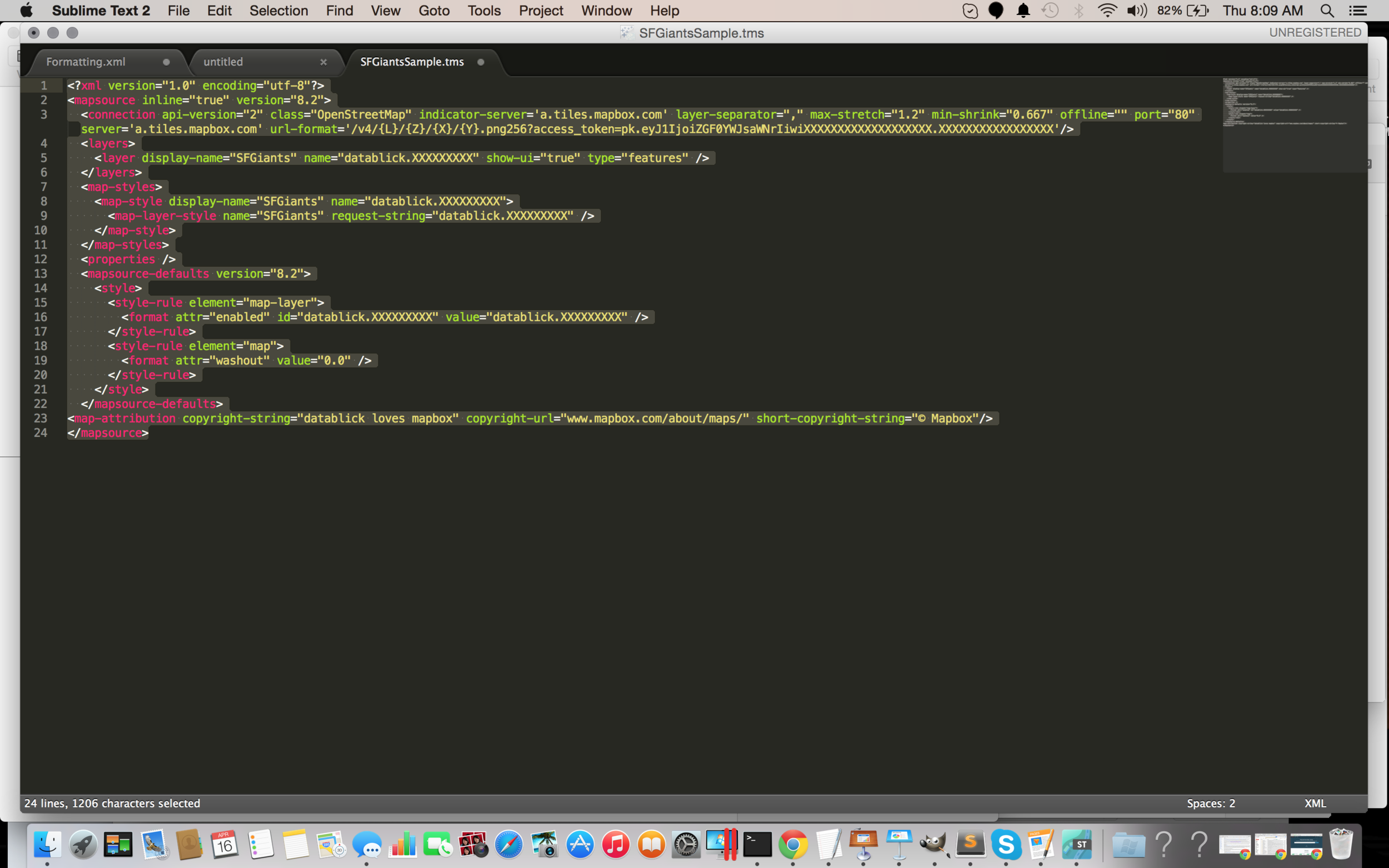
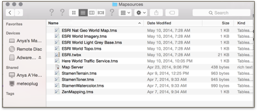
We are now going to create a .tms file to add to our map sources. Here is an example of a .tms with just one layer. The .tms file is just a little xml and can be edited in any text editor of your choice. On windows I use Notepad ++ and on the Mac I use Sublime Text.

The access_token is just your Mapbox ID and all the references to datablick.XXXXXXXXX are just pointing to your layer id in Mapbox. How and what to change is explained in great detail in my previous post http://datablick.com/2015/02/04/fast-and-fabulous-custom-maps-using-mapbox-in-tableau/, so I wont go into that here.
The .tms with a multiple layers is not that much different. There are really only 4 areas that need “find and replacing”, and you can easily add and delete more or fewer layers, but the basics are the same. The order of the layers will determine which one is on top in the stacking order, so the top layer should be at the bottom of the list.

- Replace the access_token key with your personal one from you mapbox.com account.
- Give each of your layers a name that you will use to turn it off and on in Tableau.
- Find and replace Map ID’s with yours
- Give a name to your fabulous group of layers
Now save it as a .tms file with a descriptive name, and put it in your c:\Documents\MyTableau Repository\Mapsources folder.
If you have Tableau open, then you need to close it and reopen it.
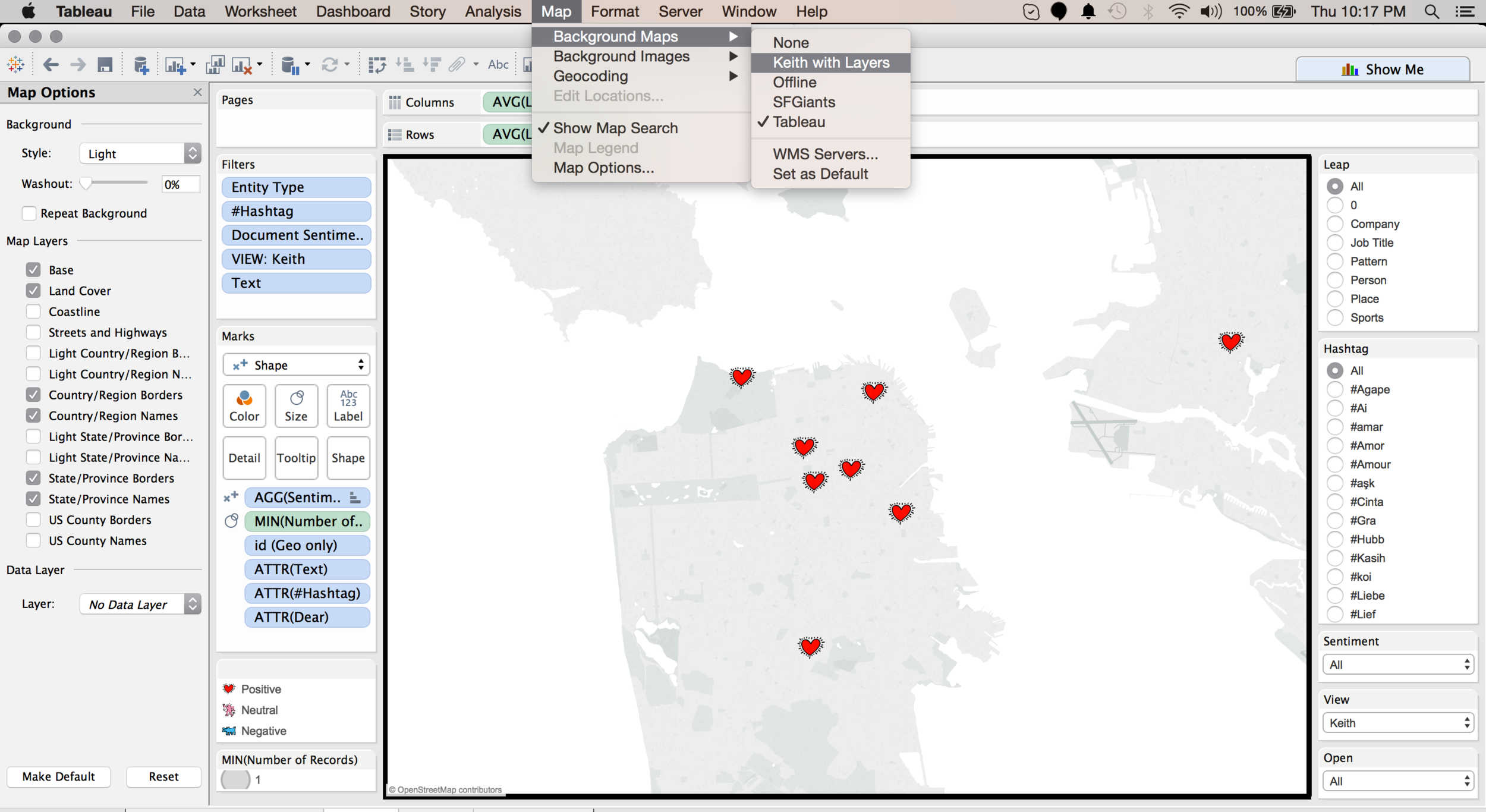
Build a basic viz that uses some location information. I am of course going to use my Twitter, Tweets of Love data. Use SuperStore if you want! Just make sure it has some SF data. Pick something like “Zip” and “Sales” and click “Show Me” to see it on a map. Now go up to the “Map” menu and select “Background Maps” and then the name that you saved your .tms file as.

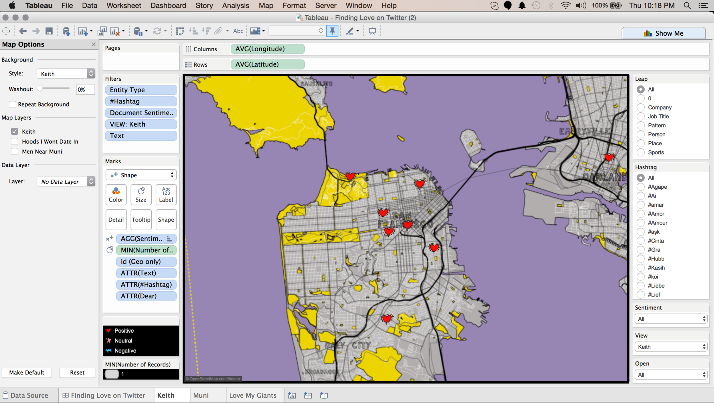
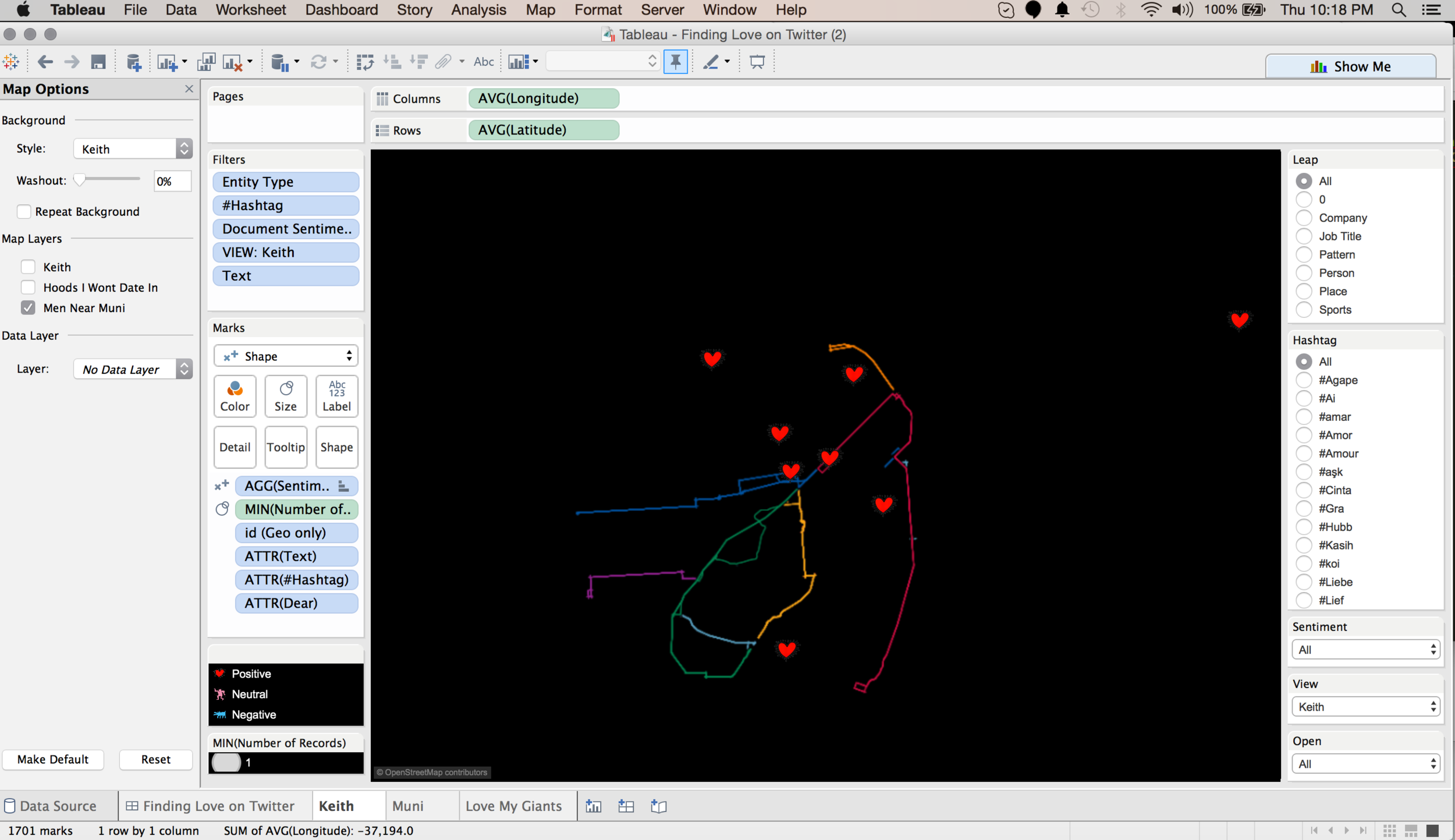
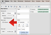
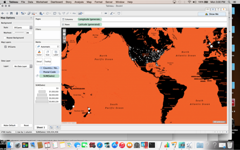
Go back to the “Map” menu and select “Map Options”. On the left you will see the new layers you just added. Toggle them on and off. Each worksheet you have can have a different combination of the layers, or all the layers. How fun is that! Here is my map with the "Keith Haring" , MUNI and Neighborhoods layers.

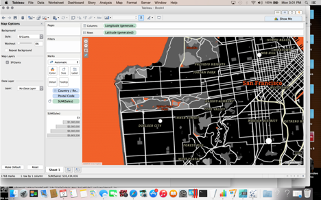
Here is my map with just the "Keith Haring" background map.

Here is my map with the "SF MUNI" layer, making it much easier for me to see Tweets of Love that came from folks that are near a MUNI line.

Here is my map with the "Hoods I won't date in" layer, making it much easier for me to see Tweets of Love that are from folks in places I will go. I was tempted to change my mind for him, because a day at the beach did sound kind of romantic.

But then of course I found the Tweet that could only have come from my True Love (found using Twitter data).

That’s all folks! Have fun with custom map layers via Mapbox in Tableau!
Now back to Allan's blog post. For the SFTUG, we decided to spice things up a bit and make my finding True Love using Twitter data a bit easier by adding Voice Control to the Viz.
Note - if you ever thought you didn’t do code, you do now girlfriend! You just edited CSS and XML. Congrats! Go treat yourself to a little something something.


