Exhibition DataBlick : Where Data Meets Art

Layering Data for Custom Tableau Visualizations
I am going to walk you through a layering technique, which allows use, and re-use of a single axis in Tableau. This can be done at different levels of granularity, different fields entirely or completely synchronized throughout, thus it can adapt pretty well to various use cases. Need to create a dual-axis in a single axis? This technique can enable this for us (as long as you need the same mark type that is).
So What? With this technique you can build more detailed and very customized visualizations directly within Tableau (without the need for extensive data prep).
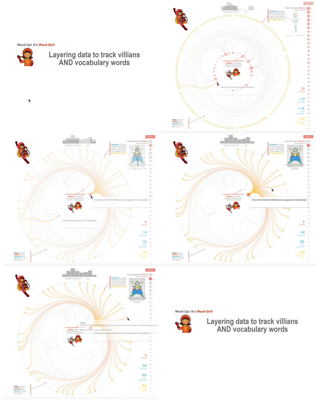
Here is an example I built out using some data I gathered on the PBS Kids show Word Girl, the current (and VERY much) favorite of my 3 and 6 year old daughters. If you want to hear the theme song, un-mute your speakers or plug in your headphones. Also, I have to give Jonni Walker a shout out for some design help, especially in making the edges glow like Word Girl’s flight trail. Full disclosure, I did learn some new word definitions while working on this project.

Vizception: Viz in a viz & native d3.js integration on Tableau Server
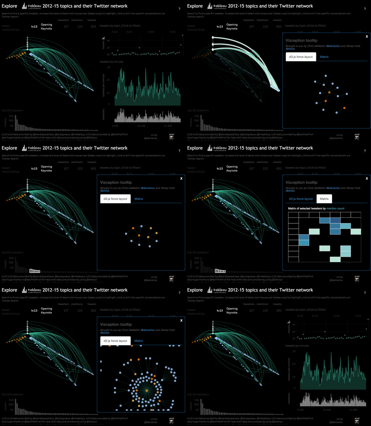
We wanted to show a real example of how to bring more to Tableau Server without additional hardware or hosting needed. That’s right, no additional server purchase requisition requests needed. There are really too many use cases to count when it comes to this, the details herein are only the tip of the iceberg.
We had a few short discussions and landed on the following example. This includes not only native d3.js integration but also an example of viz in a viz (in a viz) on Tableau Server. As a starting point, we used the twitter network graphs that Keith Helfrich and I recently shared, which were showcased on the Tableau blog last month.

Tableau Tesla
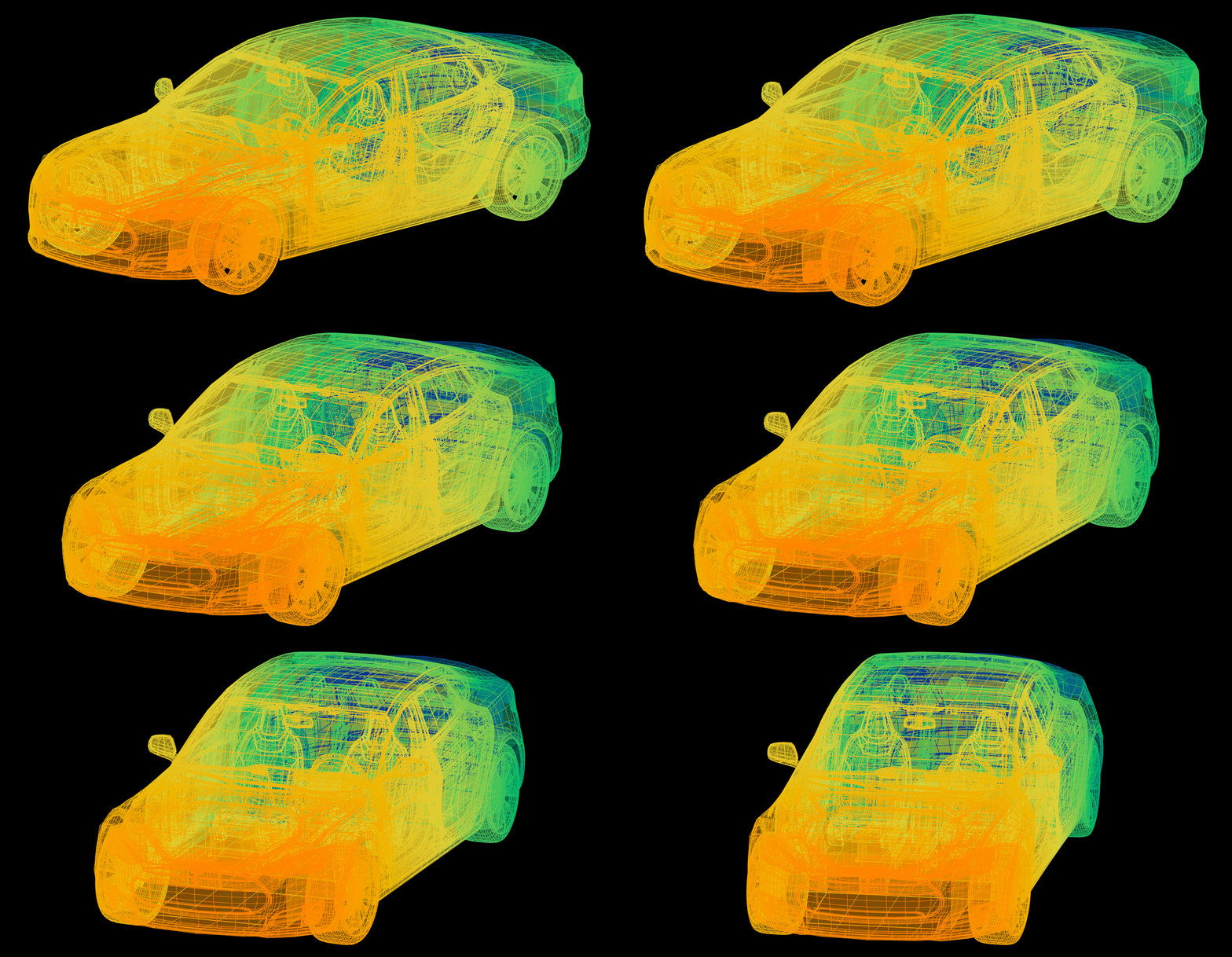
Can I make this in Tableau? When it comes to chord diagrams I’ve seen a lot of responses that make me cringe. Chord Diagrams aren’t built into Tableau, and I wouldn’t expect them to be added any time soon, but lines and polygons are sufficient to make just about anything you’d like. Seriously… I’d like a Tesla, and here is the workbook. If it isn’t loaded yet, consider that I’m building a car in a data visualization tool, and quit reading so fast!

Bay Area Bike Share
In 2014 over 85% of riders using the Bay Area Bike Share withing the city of San Francisco were yearly subscribers. For $88 a year, subscribers area allowed unlimited rides at no additional charge as long as each ride duration is less than 30 minutes. Current bike station locations are concentrated downtown, but new stations are being proposed, making the service a viable commuting option, either on its own or in conjunction with MUNI or BART service.
What train stations could a rider reach in 30 minutes? This network analysis shows the shortest route path between current and proposed stations that could be reached in 30 minutes.

The Tableau JS API Hierarchy Radial Tree
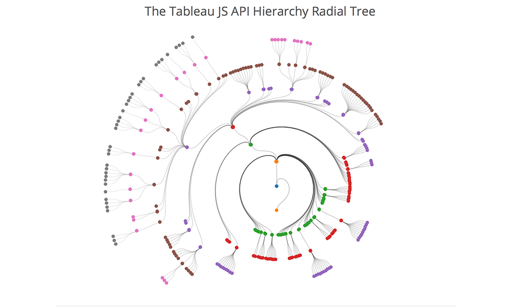
This is an incremental post to navigating your family tree from a few months back. This builds off of that visualization technique to manipulate the tree into a radial view. Also, as with the original, the tree is 100% dynamic and you can reset each node in the tree as the root node, toggle between tree views as well as change the API you are analyzing.
What is the benefit of a radial tree? As your data volume and hierarchy levels increase, you will ultimately run out of space on your screen with a traditional hierarchy. That is where the radial tree can add value. With the root node as the center of the viz, and each level of the hierarchy increasing in diameter, you ultimately have more viz real estate to work with as you dig deeper into your hierarchy.

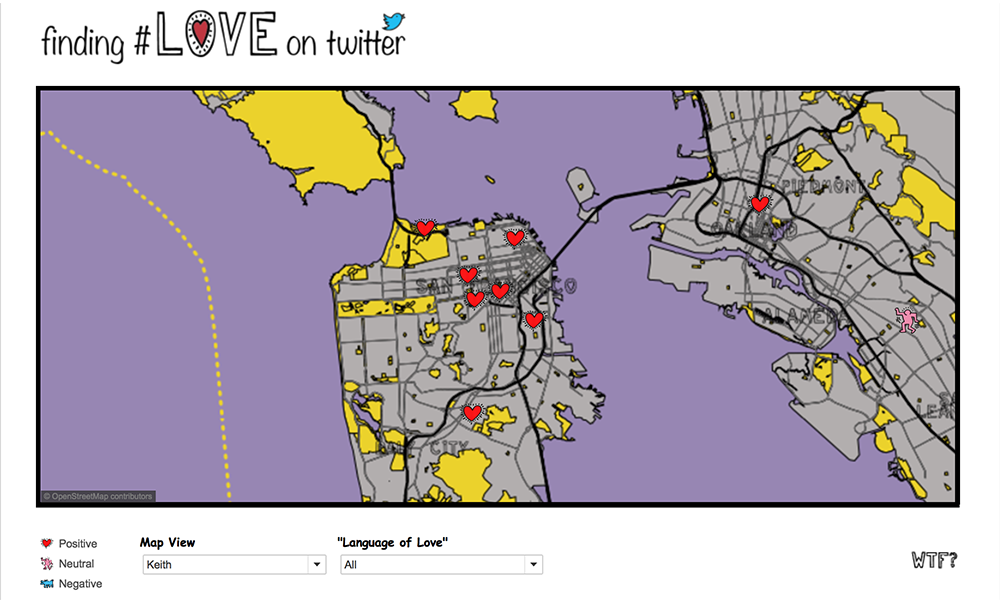
Finding #Love on Twitter
The final viz, “Finding Love on Twitter” was created as an excuse to showcase how multiple map layers created in Mapbox for use in Tableau, and the ability to toggle them on and off.
This adds onto the lessons on Mapbox customization for Tableau by showing you how to:
- Import custom shapefiles
- Edit them in QGIS (optional)
- Style them in Mapbox
- Add them to a Tableau .tms so you can toggle them on and off in many combinations to help your visual analysis.

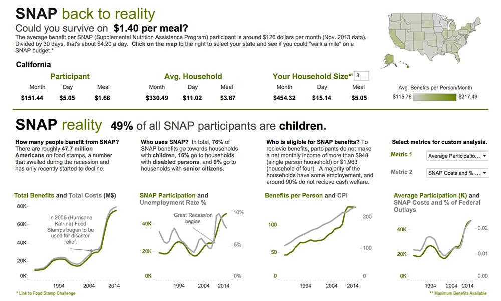
SNAP Back to Reality
This viz was inspired by Ron Shaich, founder and CEO of Panera Bread, who participated in a seven-day SNAP Challenge – living on a food and beverage budget of $4.50 a day, the average benefits available to a beneficiary of the Supplemental Nutrition Assistance Program (food stamps). “I had no clue. My SNAP Challenge last week taught me that merely observing someone else’s plight does not hold a candle to consciously altering your habits to better understand what it might be like to live someone else’s life.” The CNN article on his experience can be seen here . This viz invites to you take the “SNAP challenge” as well as provide some information on the SNAP program from 1986 – 2012.

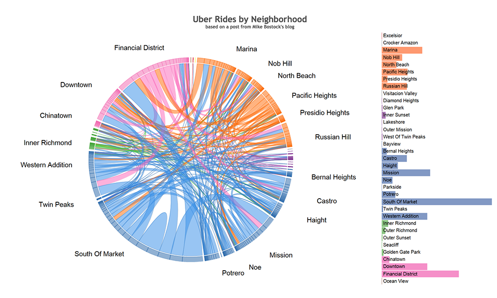
Chord Diagrams in Tableau
Can I make this in Tableau?… You can now.
Chord Diagrams are a chart that is often used for visualizing network flows that represent migration within a system, the one on the left for example, shows changes in cell phone choice for a collection of users. I’ll introduce the chart type a bit more carefully later, and provide a reference, but by the end of this post my hope is that you’ll have a sense of how you might build this type of chart with your own data in Tableau.

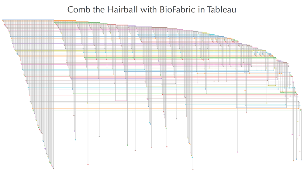
Comb the Hairball with BioFabric in Tableau
Recently I posted about creating circular and hive plot network diagrams using Tableau and a question was posted around whether we could also execute theBioFabric network graph within Tableau. There is a lot of additional information about the BioFabric network graph at their website. The super-quick demo is a good intro to the graph if you have not seen it before.
The answer to the question posted is yes and this post is designed to walk you through the steps needed to build your own BioFabric graph within Tableau.

Twitter TV Set
This was a fun visualization to analyze twitter data on current “hot topics”. A nod to Shel Silverstein’s “Jimmy Jet and His TV Set”, this Viz focuses on the obsession of Twitter and how the tweet has become more the news than the news itself.

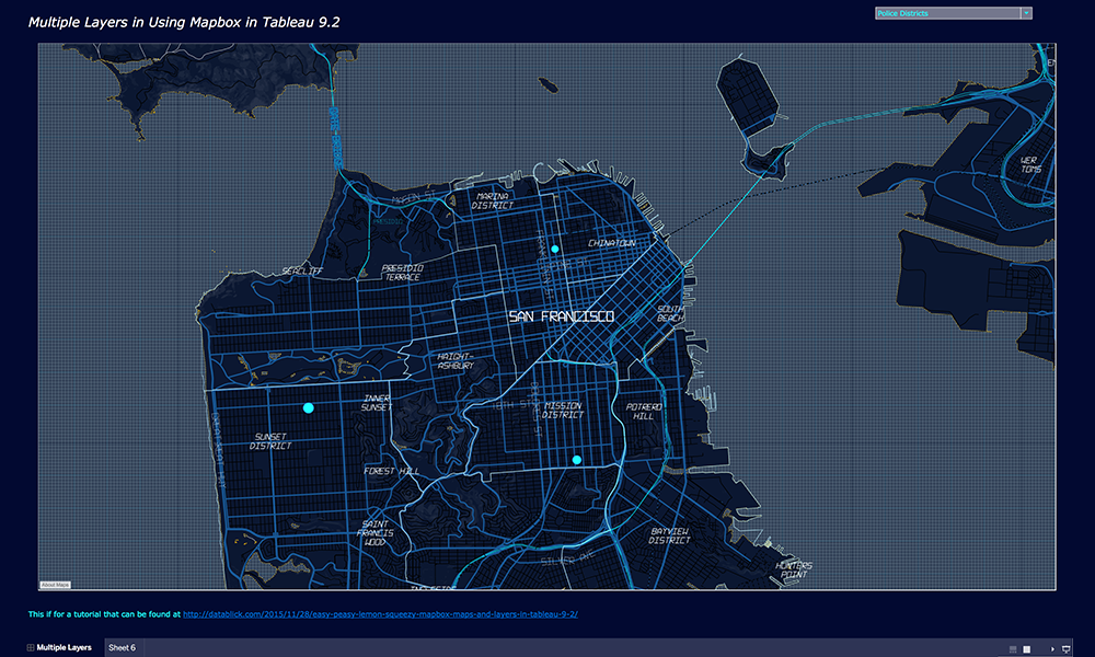
Multiple Mapbox Layers in Tableau 9.2
Learn how to add multiple Mapbox layers using the new UI in Tableau 9.2 and create a Parameter to swap out map view.

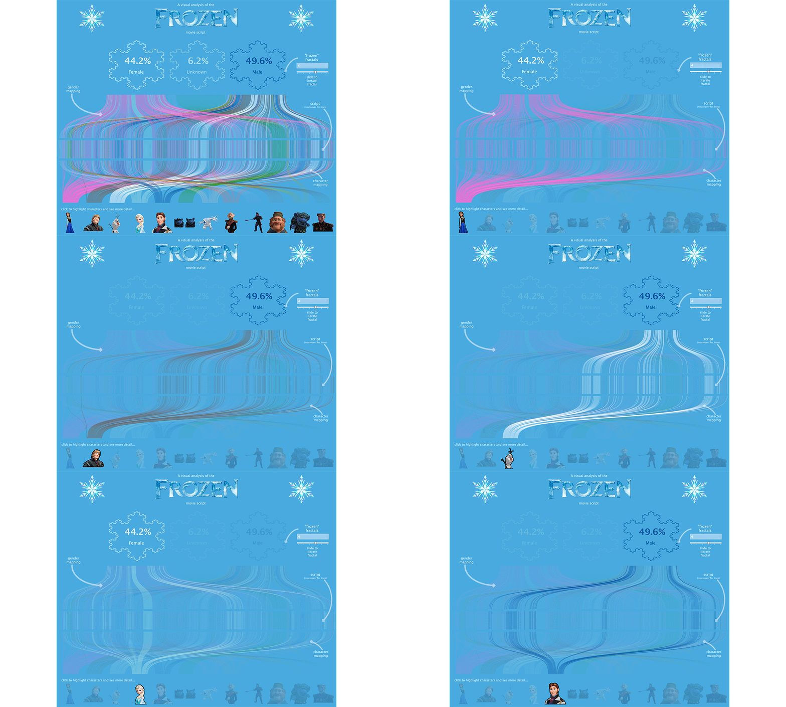
A Visual Analysis of the Frozen Movie Script
Use this beautiful Frozen Viz to analyze character interactions by Gender. Your 4 year old never loved Data Viz this much!

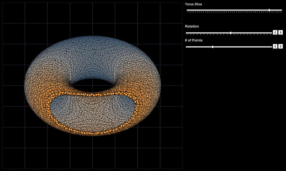
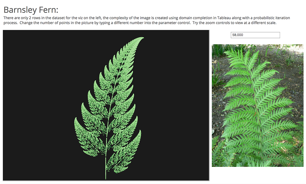
Creating data, multi-step recurrence relations, fractals and 3D imaging… without leaving Tableau
Showing Jonathan Drummey an early version of the 3D Tableau workbook, his response included some words I’ve reflected on since: “Just because I can, doesn’t mean I should.” The comment wasn’t disparaging, it was directed at examples of 3D pie and bar charts I’d built which I’ve since removed. I’m not a fan of 3D charts. Tableau is perfectly capable of doing 3D charts; they just weren’t built in because they tend to distort more than engage.
What follows is not meant as a point of view on best practices, rather it is an exploration of some techniques I’ve been playing with and thought others might find interesting (or at least pretty). These examples exists because they can; the jury is out on whether or not they should.

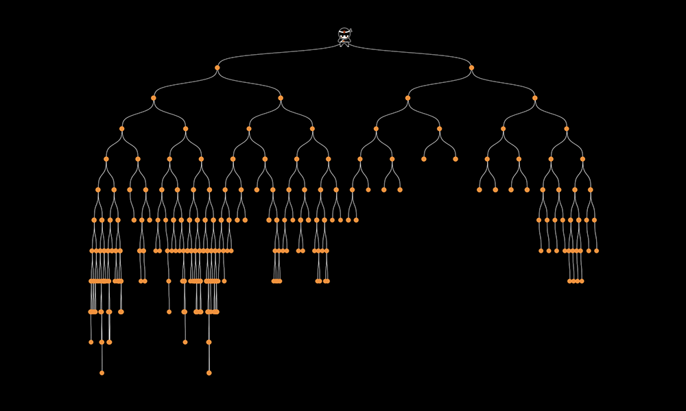
Navigating your Family History in Tableau
The Viz
We are going to build two tree views in Tableau, an ancestor view and a descendant view of a dynamically selected root person. Within this post I will walk through building the ancestor tree (a binary tree), feel free to reach out if you want more information on how the descendant tree was built, but will leave that to the imagination for now.

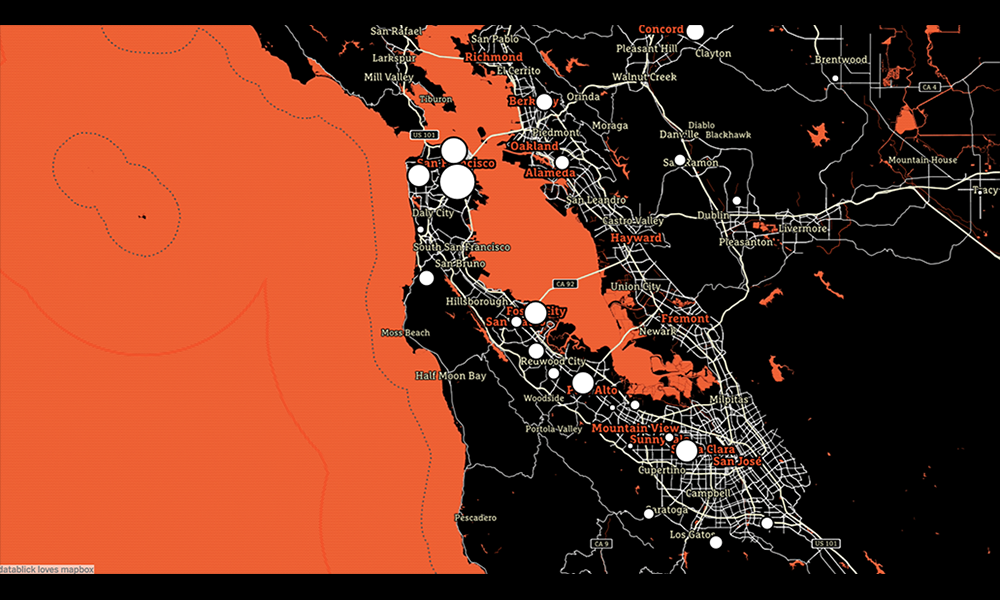
Fast and Fabulous Custom Maps using Mapbox in Tableau
So the last time I wanted a custom map, I ended up building my own WMS and spending months and $’s to get the map I wanted. Then one day recently, I had a cocktail with Allan Walker (that insane mapping Zen dude) who pointed out that if you just opened up a .tms file in notepad, there just wasn’t all that much to it but a wee bit of xml.
What follows is another DataBlick tutorial on making custom maps in Mapbox.

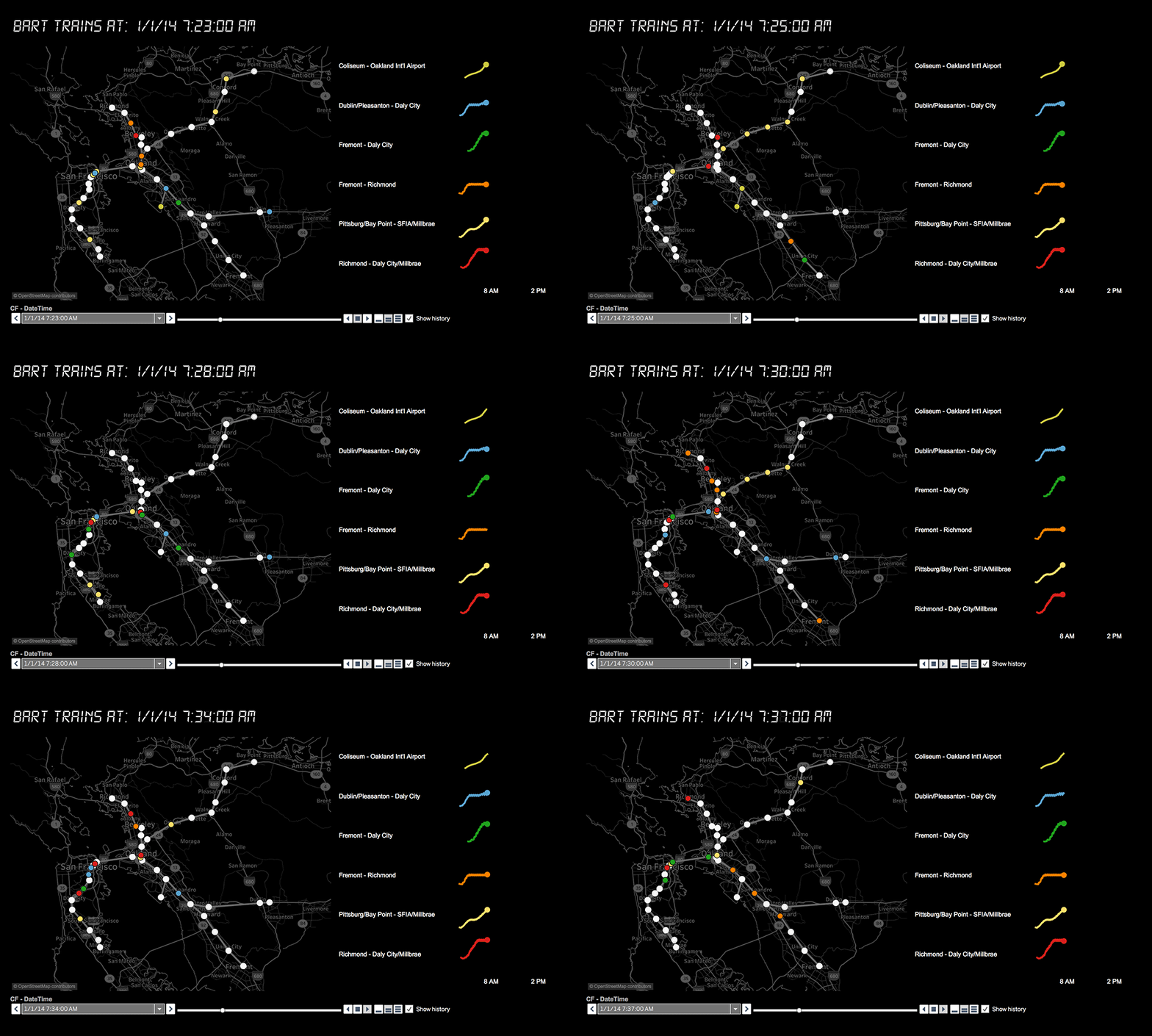
Building a Visualization of Transit System Data Using GTFS
The General Transit Feed Specification (GTFS) defines a common format for public transportation schedules and associated geographic information. GTFS “feeds” allow public transit agencies to publish their transit data and developers to write applications that consume that data in an interoperable way.
This tutorial will show you how to use Tableau to build a map of transit data and incorporate it in a BI dashboard for analysis. What is the average route duration, fare, number of stops? How many are wheelchair accessible? Don’t care about BART? Check out the list of all the agencies that use this format at http://www.gtfs-data-exchange.com/agencies .

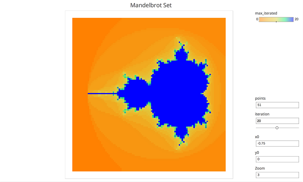
Mandelbrot Set in Tableau
The Mandelbrot set is produced via recursion on the complex plane. Alternatively, this can be thought of as a 2 dimensional real iterative process, with a bit more complexity in the formula.
A point is out if the sequence of points diverges (i.e. gets further and further from zero). The remaining points form the Mandelbrot set. If the distance from zero ever becomes greater than 2, then the sequence is certain to diverge. This fact is often used to color the complement recording the first iteration where this distance was greater than 2. In practice only finitely many iterations can be performed (and with finite accuracy) so this is really a sketch. The viz is parameter driven, so the center, zoom, number of iterations and resolution can be adjusted. There are only 8 rows in the source data, which is not too shabby for an infinitely complex mathematical structure.

Building Life in Tableau
DNA can be expressed as a number, if say you wanted to upload yourself to your Tableau public account. Would you fit? There are 4 base pair possibilities, so this could be encoded in 2 bits; so with 8 bits in a byte you could store 4. There are about 3 billion base pairs in human DNA, 3 billion/4 = 750 million bytes or about 750 megabytes. So even in an uncompressed format you would fit well under the current 1GB storage limit of Tableau public! So future generations of data enthusiasts could download you as a packaged workbook, then using their advanced technology they could bring you back.

Orrery Remix
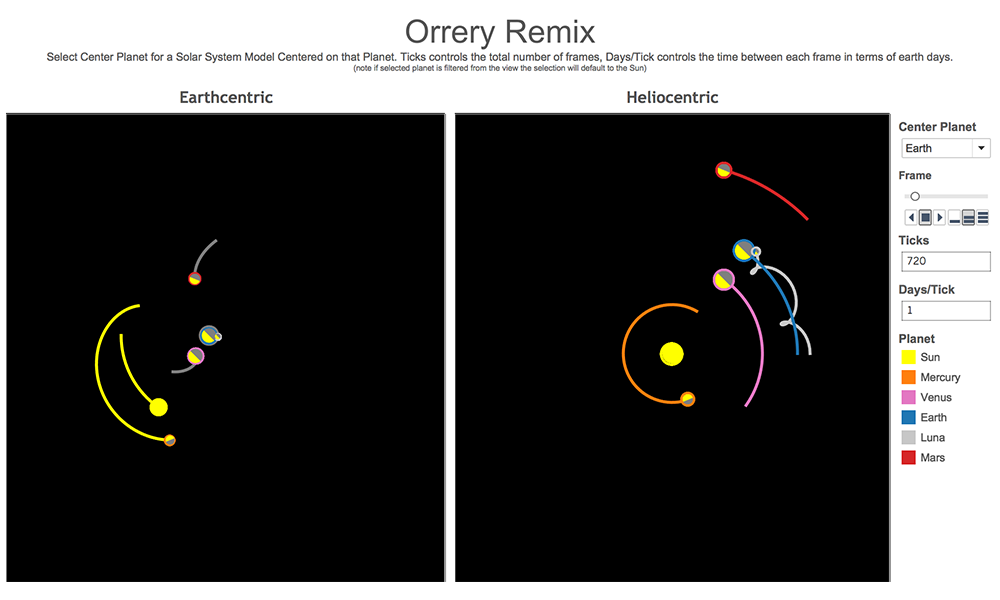
The Orrery is computation driven; the position of the planets are computed on the fly in Tableau and the data source driving this piece of art is almost an afterthought. It could literally have been built on Superstore Sales, you just need a place to hang the results of computations. In the case of Jonathan’s Orrery, this structure comes in the form of a SQL query that generates a hugely redundant data set. In all it has 51,840 rows. There are 18 planets (counting the sun and various moons), 360 ticks for the frames in the animation and 8 wedges for the slices that make up the pie charts used to draw each planet showing day and night (best use of pie charts ever!), 18 x 360 x 8 = 51,840.

Dynamic Small Multiples in Tableau
Dynamic?
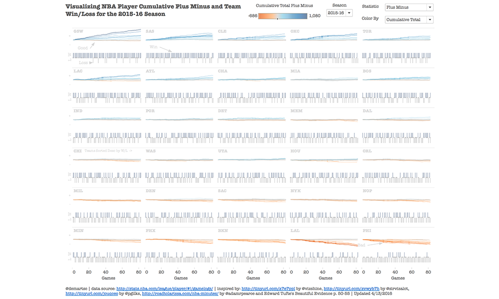
One of the tricks with small multiple design is the fact that you have to lay out the graphs in a trellis panel (aka a grid). This can be accomplished by hard coding and sorting the partitioning dimension of your analysis, however, I challenged myself to calculate the location for each graph within Tableau on the fly. The reason why I wanted to do this was to be able to update, change between seasons, etc. without having to do any additional work on the trellis layout of the small multiple viz.

The Great Divide
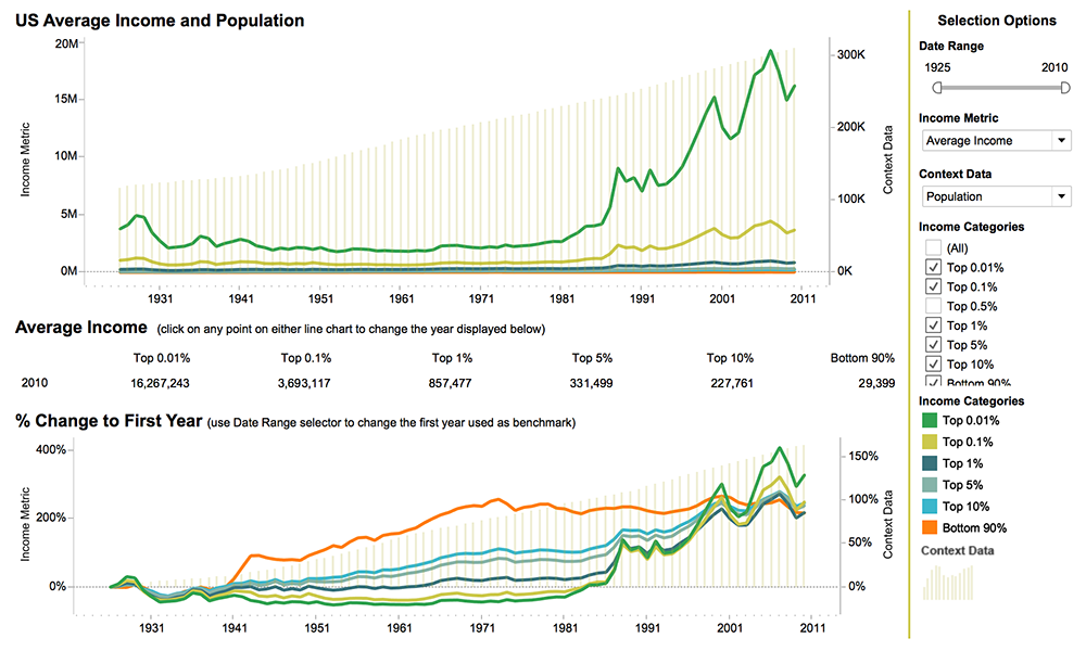
This viz was created based on the research of Thomas Piketty and Emmanuel Saez, “Income Inequality in the United States, 1913 – 1998”. It shows the Income Share or Average income over time and by income group. It also provides an additional layer of user selected historical context data, such as GDP and CPI and the ability to change the “benchmark” year so changes relative to a specific time period such as wars, or deregulation can be highlighted. This viz was the winner of the Tableau 2012 Biz Viz contest.

Tornado Alley: 2012 Iron Viz Champion Viz
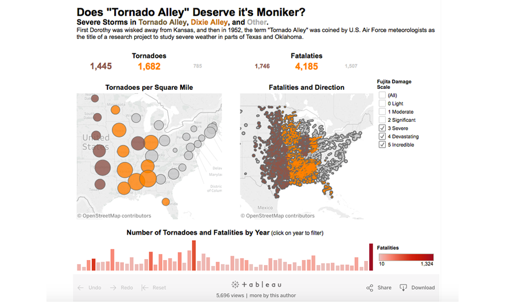
This viz was created for the Tableau 2012 Iron Viz competition in San Diego at their customer conference. It was created in 20 minutes, while onstage, using a provided data set. The viz shows the region called “Tornado Alley” and compares the number of tornadoes and fatalities to other regions. It was the winning viz!

Firework Injuries
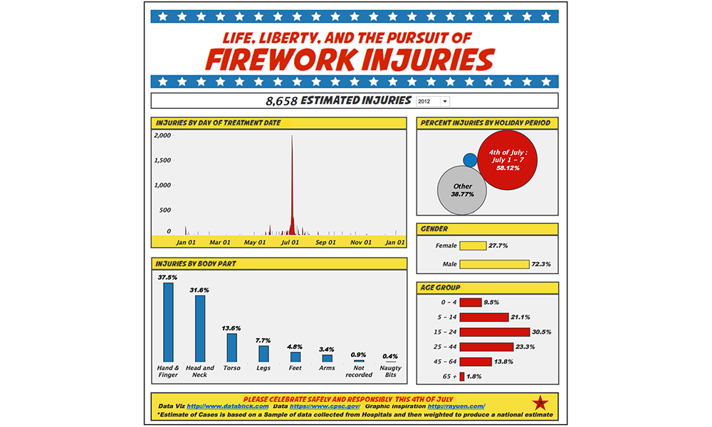
Using data from the Consumer Product Safety Commission, this visualization highlights all the injuries due to fireworks that happen, highlighting the 4th of July holiday period. Click on any category to filter on it, and explore what injuries occur across dates, genders, and age groups. Males seem to be more likely to get injured overall, and their injuries are to their hands and fingers. Females are more prone to head and neck injuries. Sadly, wee ones are almost 10% of injuries, mostly over the 4th of July week. Hover over any category and you can drill through to the gory details of the injuries (even the naughty bits).
Please be safe this 4th of July and enjoy fireworks responsibly.
Special thanks to Ray Yuen http://rayuen.com/ (of Pokemon fame!) for the comic book graphics inspiration.
